There’s a quiet magic to the light that lingers in late autumn afternoons – that golden haze that softens everything it touches. The Fall Warmth palette, inspired by this moment, celebrates color that feels both radiant and rooted.
For florists and designers alike, it’s a story about warmth that invites connection in a palette that bridges rustic authenticity and refined sophistication.
Where Golden Hour Meets the Design Table
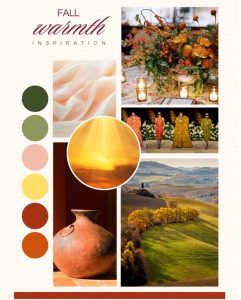
This season’s color story finds beauty in contrast: amber and terracotta balanced by honey neutrals and grounded greens. The result is a palette that feels elevated yet effortless and ideal for event installations and everyday retail arrangements alike.
“Fall Warmth captures what designers are craving most – tone, depth, and a sense of grounded luxury,” says the Choice Farms marketing team. “It’s versatile enough to translate from wedding arches to boutique displays.”
Bloom Highlights Featured in Our Fall Warmth Shoot:
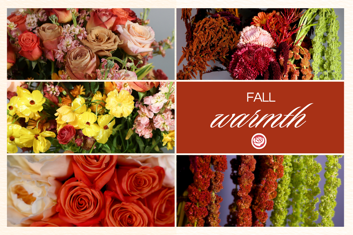
The Fall Warmth palette comes to life through a curated mix of caramel neutrals, golden accents, and rich bronze tones.
Standout blooms include Toffee, Shimmer, Symbol, and Coffee Break roses. A bridal bouquet boldly layers our Juliet Garden Rose for softness and Orange Crush for depth. Textural touches from Marrakesh Bronze Cremon, Red and Green Amaranth, and Magical Chocolate Butterfly Ranunculus create movement and dimension, while Yellow Ranunculus adds a radiant pop of light within the palette.
Why It Resonates Beyond the Vase
Design Meets Market Insight
Fall Warmth aligns with the broader design world. Fashion and interiors alike are leaning toward sun-warmed palettes, luxurious layering, and organic textures. Pantone’s A/W 2025 palette — with hues like ‘Brandied Melon’ and ‘Chutney’ — echoes these same sun-drenched shades.
Natural Materials and Sustainable Design
Wedding and event clients are seeking authenticity and this palette delivers it naturally. Think linen runners, ceramic vases, and reclaimed wood tables paired with olive foliage and candlelight. The result is a look that feels intentional yet grounded in comfort.
For the Everyday Florist
For wholesale florists, this trend translates directly to sellable color stories. Combine cremons, roses, and stock in complementary warm tones for autumn walk-in arrangements, window displays, or corporate accounts that want seasonal sophistication without overdesign.
The Heart Behind the Palette
Fall Warmth is about more than color – it’s about craftsmanship and connection. Every stem featured in this palette was hand-selected from our trusted farms, ensuring consistency and freshness whether the order is for a high-profile wedding or a busy fall retail week.
It’s how Choice brings reliability and artistry together season after season.
Explore Fall Warmth
As the seasons shift, Fall Warmth reminds us that color has the power to shape emotion and design alike. Each bloom tells part of that story – radiant, grounded, and timeless. Because at Choice Farms, quality, consistency, and care aren’t just promises — they’re the foundation of every bloom we deliver.
To learn more about the varieties featured or to plan your next order, contact your Choice Farms sales representative.
References:
– WFFSA: 2026 Wedding Trends: https://wffsa.org/2026-wedding-trends-what-to-expect-and-how-flower-wholesalers-can-stay-ahead/
– Cassia Thomas Wedding Trends 2026: https://cassiathomas.com/wedding-planning-en/wedding-trends-2026/
– Pantone Fashion Color Trend Report A/W 2025–26: https://www.pantone.com/articles/fashion-color-trend-report
– YSL Spring 2026 Runway Show
– @laurynprattes and @sophiefelts


Leave a Reply